DURATION

2 week sprint, Jan 2023

2 week sprint,
Jan 2023

TOOLKIT

Figma, Miro, Notion, Google Suite

TEAM

Desmond Lui (UX Research),
Shanice Woo (UI Lead); &

Felicia Tay (Product Management)

ROLES & RESPONSIBILITIES

ROLES

Project Manager

Roadmapping of sprint tasks and deliverables, task allocation based on team member's skills & expertise, oversee standardisation and documentation of design system and overall deliverables

UX/UI Designer

UX Copywriting lead, User Research, Market Research, Sketches, Wireframing, Prototyping, Usability Testing

The Context

Flour Power is a social enterprise bakery that specialises in selling baked goods with cookies as their core product. Their ethos is to empower marginalised communities or individuals with special needs by providing them with training and employment opportunities.

Flour Power is a social enterprise bakery that specialises in selling baked goods with cookies as their core product.


Their ethos is to empower marginalised communities or individuals with special needs by providing them with training and employment opportunities.

The Problem

Flour Power sells some great cookies - and I don’t say this lightly since my team travelled down to their kitchen to sample them ourselves!

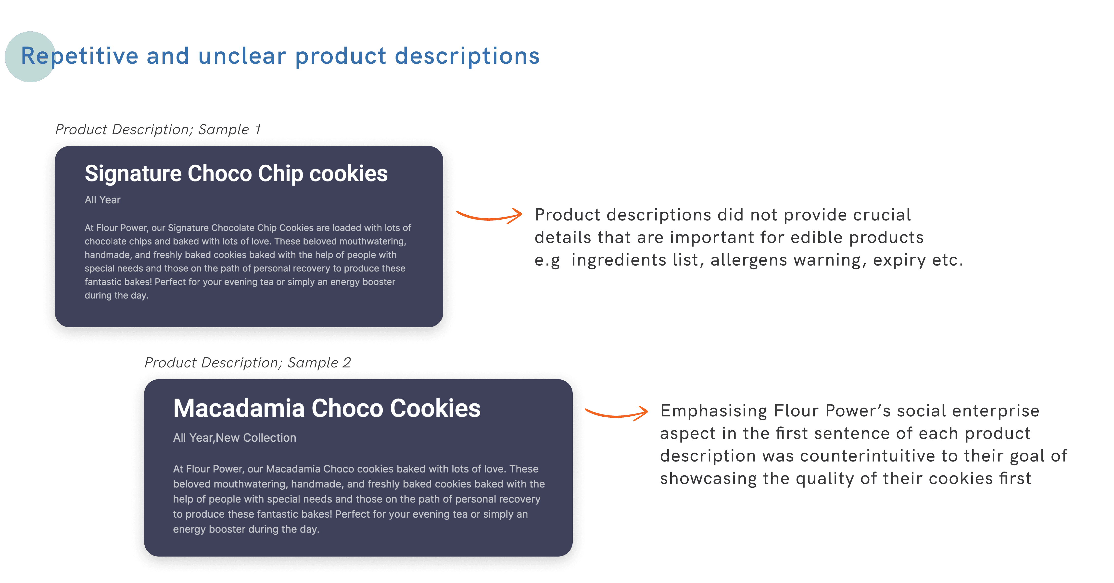
However, consumers often shoe-boxed Flour Power into being "just another social enterprise" before even considering that they do create delectable bakes. This was contrary to the client’s vision, which was for Flour Power’s defining characteristic to first and foremost be their quality cookies.


The first step to addressing this stereotype was to redesign a website that would reflect the brand positioning as a quality cookie store first, social enterprise second.

The Approach

How do we showcase cookie products front-and-centre while retaining the heart of the brand as a compassionate and inclusive social enterprise?

The Limitations:

The Limitations:

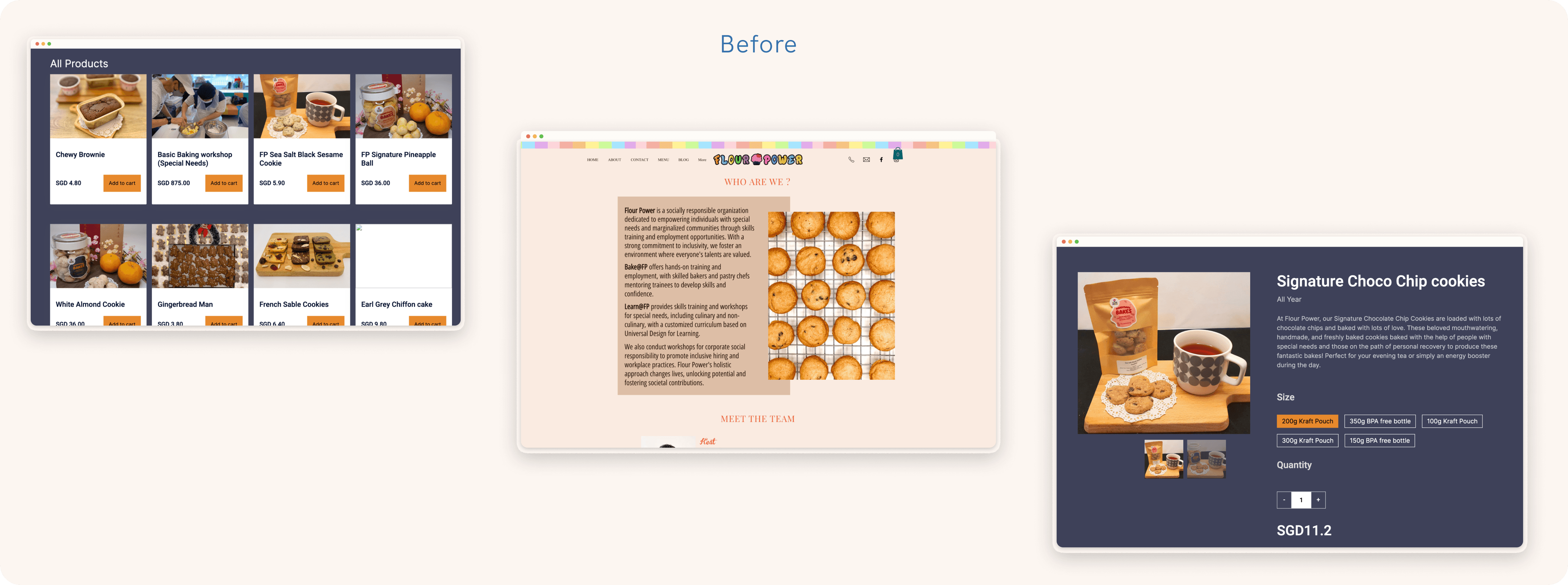
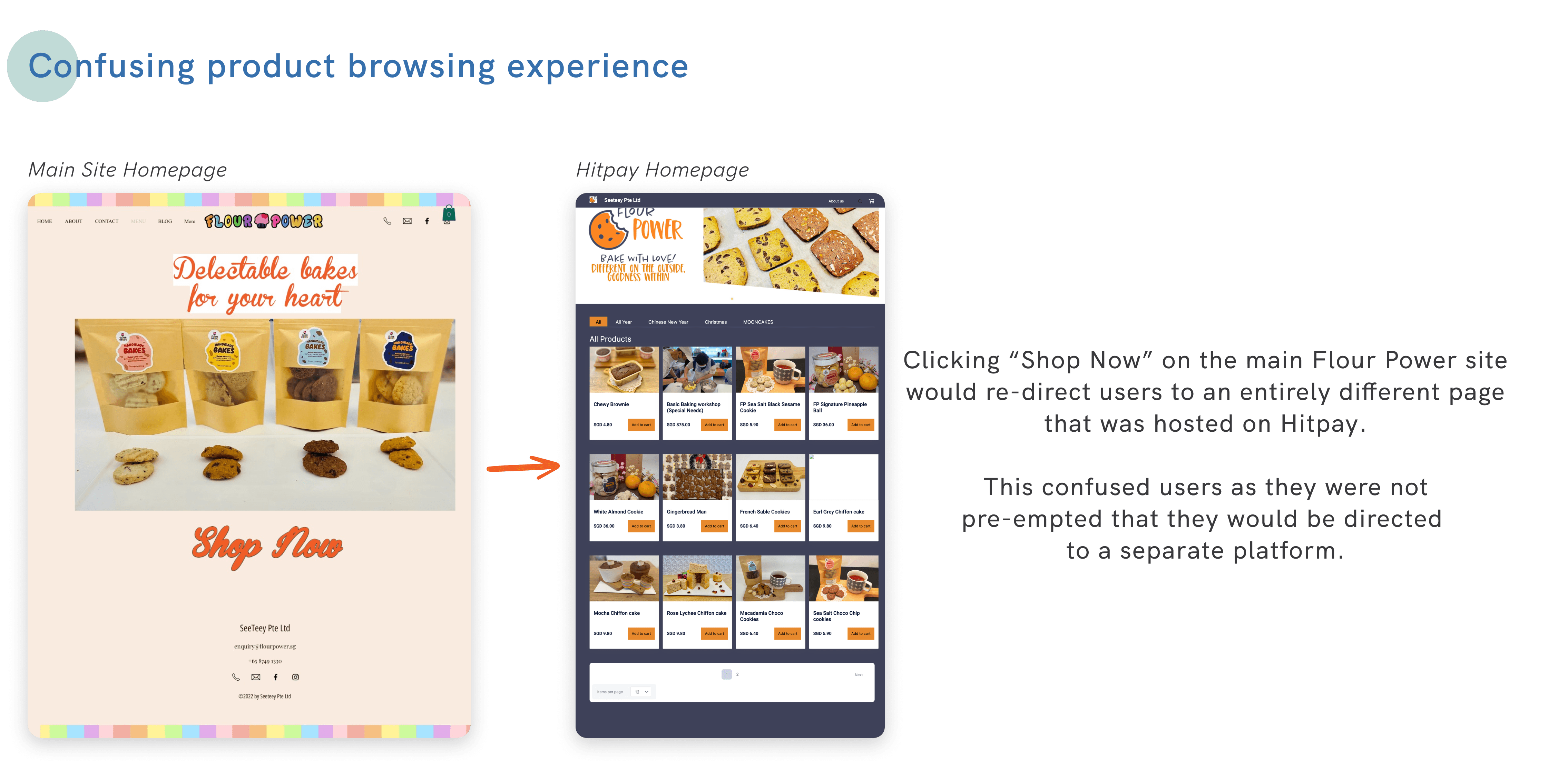
Flour Power's e-commerce site was hosted on Hitpay, a no-code online payment platform. It was an accessible and easy solution for a lean team who dedicated the majority of their time to hand-making cookie orders.

As such, we needed to consider how the re-design could be easily adopted and updated as and when the menu of the shop changed (which was quite often!).

Flour Power's e-commerce site was hosted on Hitpay, a no-code online payment platform. It was an accessible and easy solution for a lean team who dedicated the majority of their time to hand-making cookie orders.

As such, we needed to consider how the
re-design could be easily adopted and updated as and when the menu of the shop changed (which was quite often!).

The Goal:

The Goal:

After discussion with the client and assessing the current site, we decided to proceed with an entire site revamp. This would see a refresh in visual design and an overhaul in pages to streamline information architecture and improve product positioning.

The goal was to achieve the following:

  1. Create and implement a style guide that aligned with the client's new logo and brand colours; and

  2. Develop a content strategy that better positioned their cookie products vis-a-vis their brand story

The Game Plan:

The Game Plan:

Keeping in mind the limitations, we knew that it may not be the most feasible solution for our client to apply the entire redesign throughout their site.


Hence, we also proposed modular solutions such as content frameworks (e.g. a template for product descriptions) which could be implemented independently for incremental improvements to the current site.

Measuring Outcomes

System Usability Scale

System Usability Scale (SUS)

To validate our redesign, we tested both the current site and final prototype with 15 users.


During testing, we administered the System Usability Scale (SUS) to users to gauge their overall impression of the experience of using the site.

From the original site to our final design, the SUS score improved from 43.75 (B grade) to 81.5 (A grade).

What I Did

This entire design sprint was a collaborative effort with the team. While we were all involved throughout the end-to-end UX design process, there were periods when one of us would take the lead depending on our strengths.

For me, this meant taking on the role of Project Manager and Lead for UX Copywriting.

As Project Manager, I led the team in roadmapping our tasks and deliverables to ensure we could produce quality designs in the short time frame. During our meetings, I checked in with team members to ensure everyone was aligned on the direction while also playing the role of facilitator and record-keeper to synthesise and document key discussion points.

As Lead UX Copywriter, I wrote the body copy for the redesign as well as developed a content framework for product pages which can be easily applied by the client. When writing, I strove to ensure that there was a consistent tone which reflected the fun spirit of Flour Power while still conveying information in a clear and concise manner.

What's Next?

What's next?

At the end of the sprint, the team presented and handed over our design to Flour Power CEO, Mr Yeo. While there may be resource limitations when it comes to adopting the design wholesale, I was encouraged by Mr Yeo’s positive reception to the redesign and hope that some of our suggestions can be adopted by the team for application to their site.

Aside from that, the team also worked with a 5-person developer team to code out our website as part of a bootcamp project collaboration. It was a great first experience working with developers and was exciting to see our designs realised in a coded website!

Still curious? Scroll to view the detailed process

Still curious?
Scroll to view the detailed process

Business Needs

Business Needs

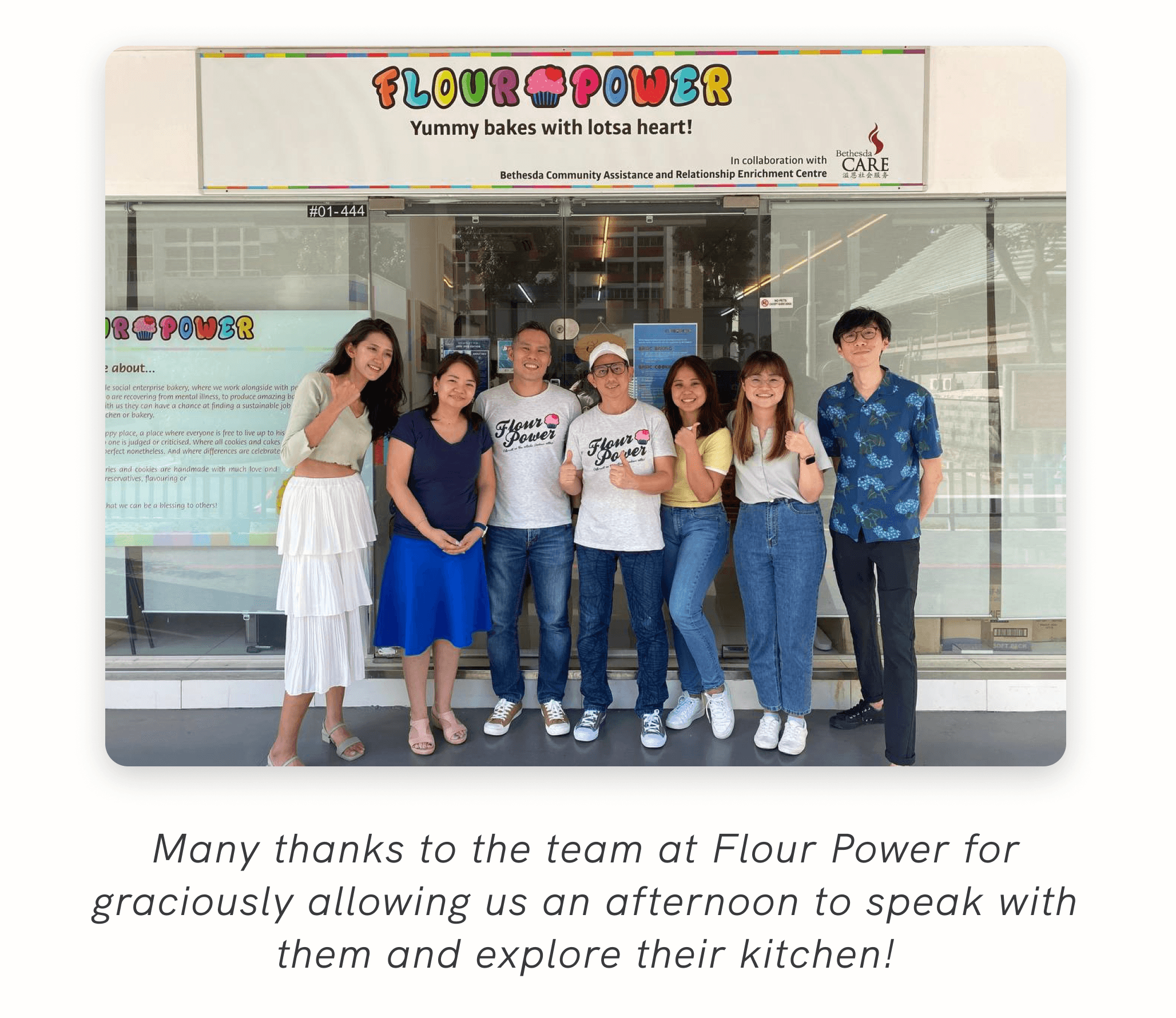
To get a better understanding of Flour Power’s brand voice and product offering, my team conducted a site visit to Flour Power to speak with the team.

Through our conversations, we realised that Flour Power has an innovative and entrepreneurial spirit that is demonstrated through their commitment to continuously better the entire consumer experience - from R&D on recipes and cookie packaging, to improving the delivery service.

However, this information was missing on the site. We needed to showcase these behind-the-scenes efforts which would elevate their products' positioning in the online baked goods space.

User Stories

Aside from understanding the client’s position and their needs, we needed to drill down into what users wanted from an e-commerce food experience.

Key user stories gleaned from 14 user interviews were:

Were key user needs being met on the site?

What’s really
happening on
the current site?

What’s really happening on the current site?

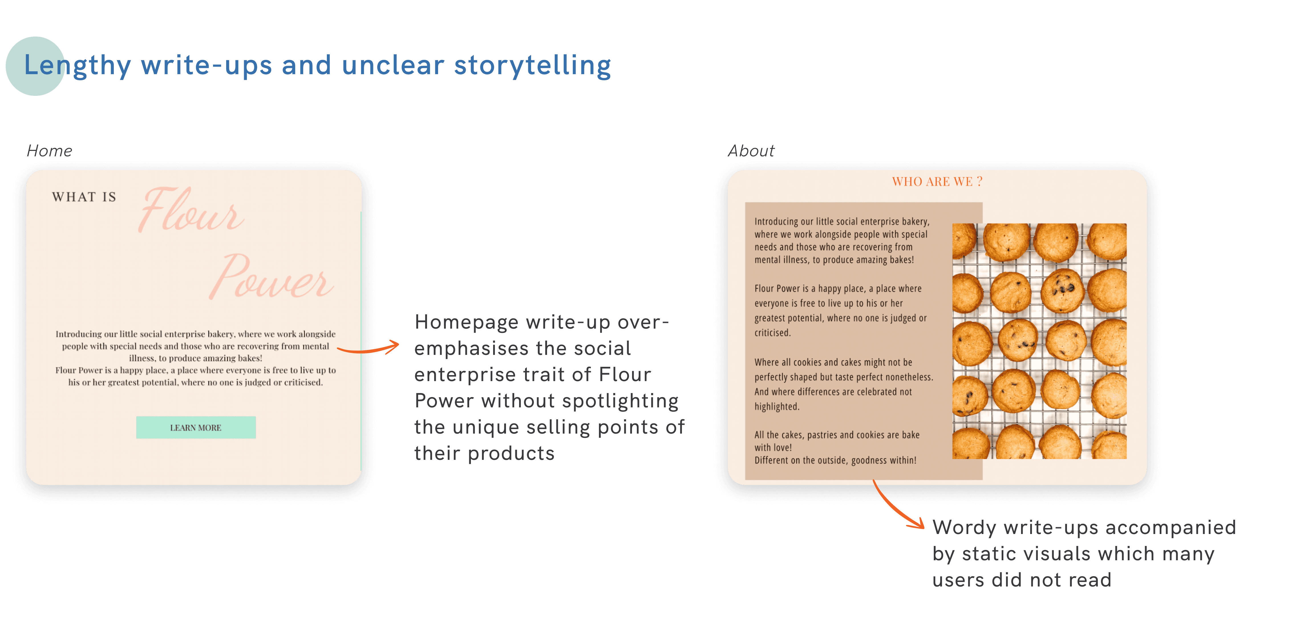
Through contextual inquiries and comparative analysis with other e-commerce bakery sites, we identified that the current site was plagued by a lack of content strategy, a confusing site map, and unclear processes when it came to product browsing and checkout.

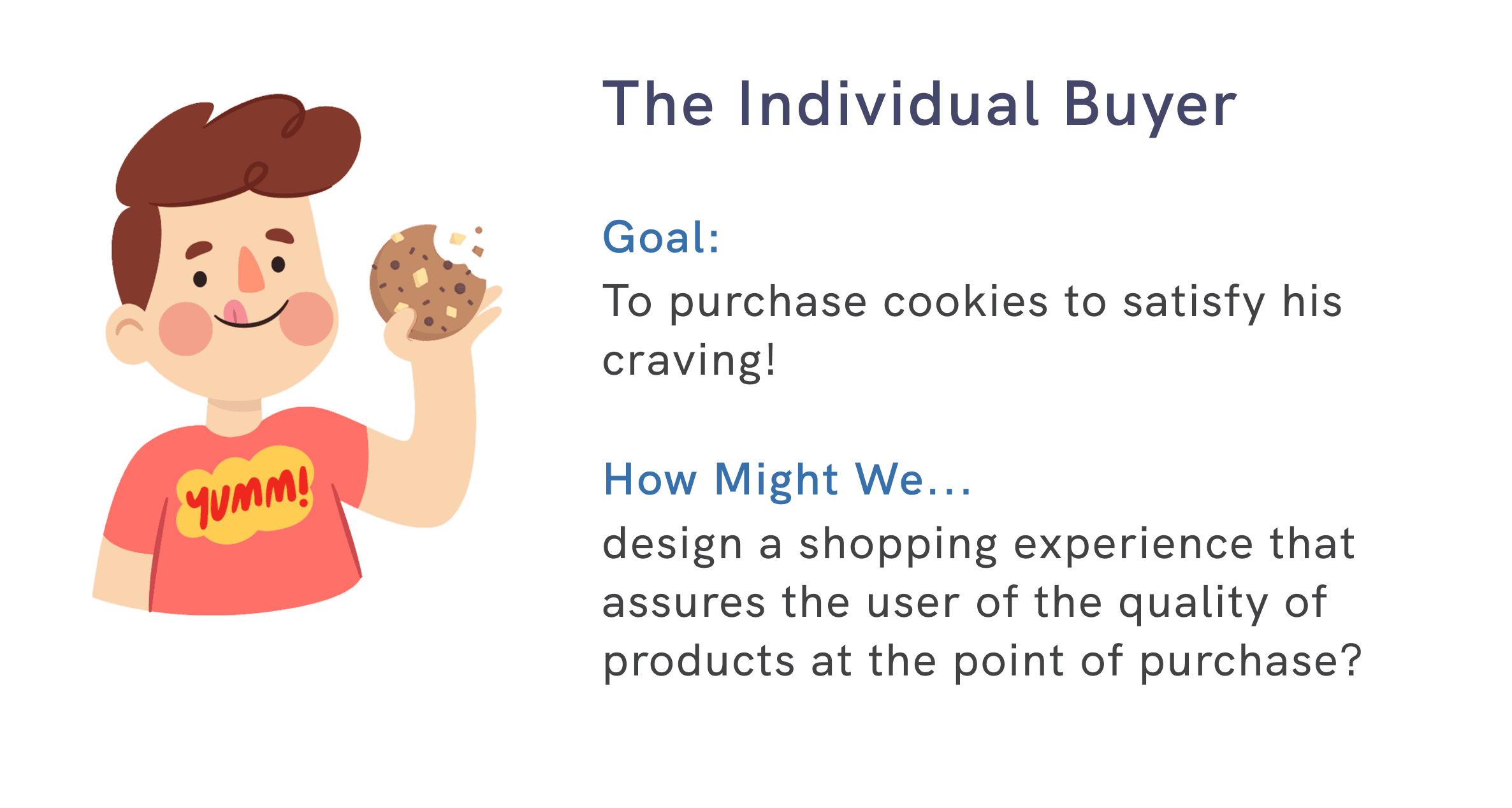
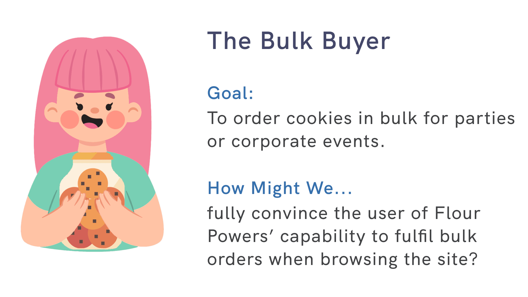
Designing for 2 core demographics

Designing for
2 core demographics

When conducting user research, we targeted two main demographics that we knew were the main consumer base for Flour Power. From our data, we then teased out the key goal for each demographic that would inform our design direction.

Solutioning

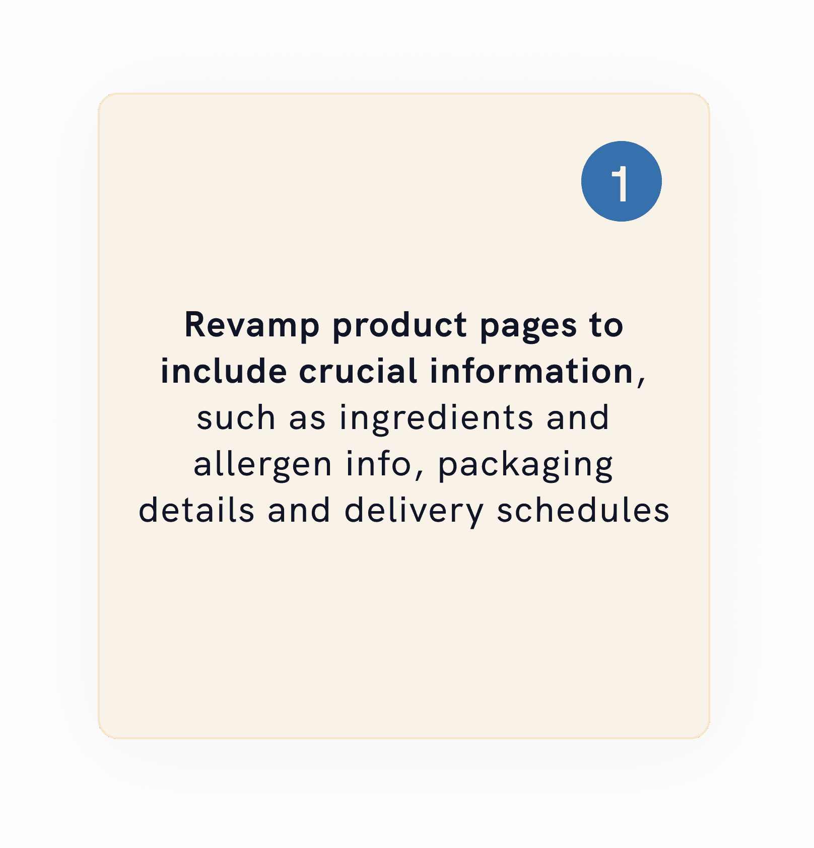
After several rounds of team discussions to whiteboard and sketch our ideas, we narrowed down to the following solutions that centered around the needs which both target groups required:

Assurance that they would receive complete and
quality orders of cookies upon ordering from the
Flour Power website.

Assurance that they would receive complete and quality orders of cookies upon ordering from the Flour Power website.

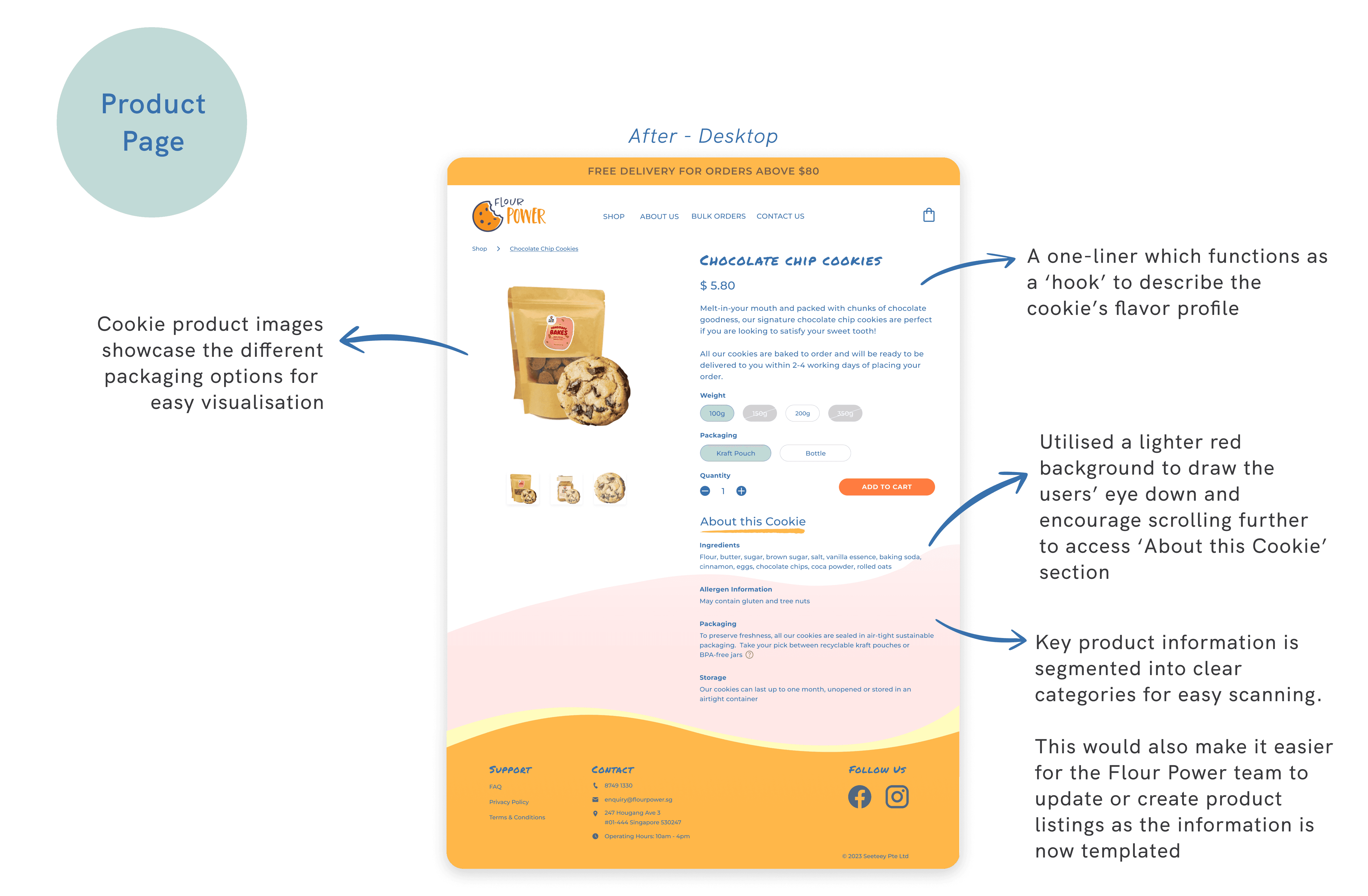
Product Page

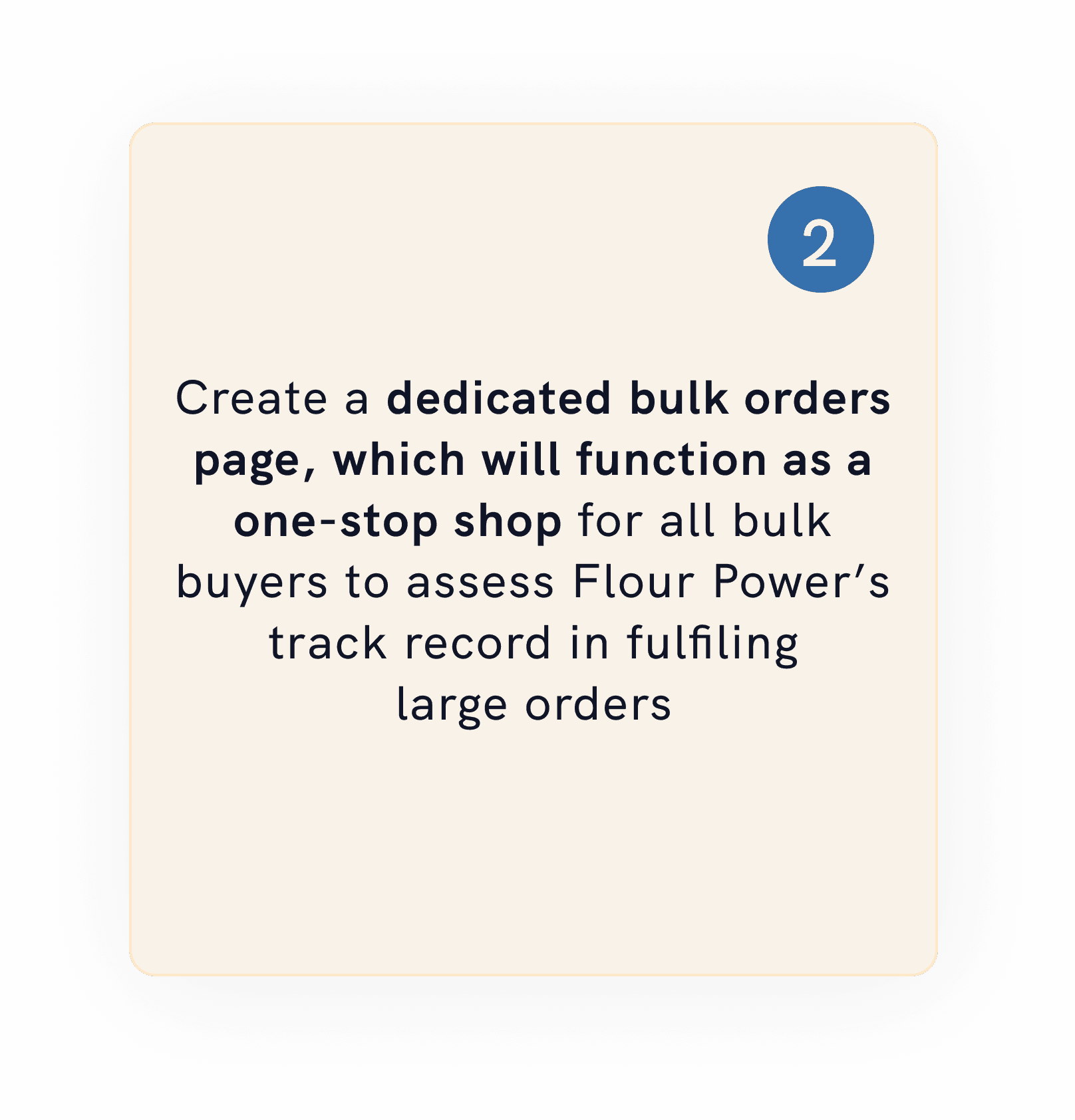
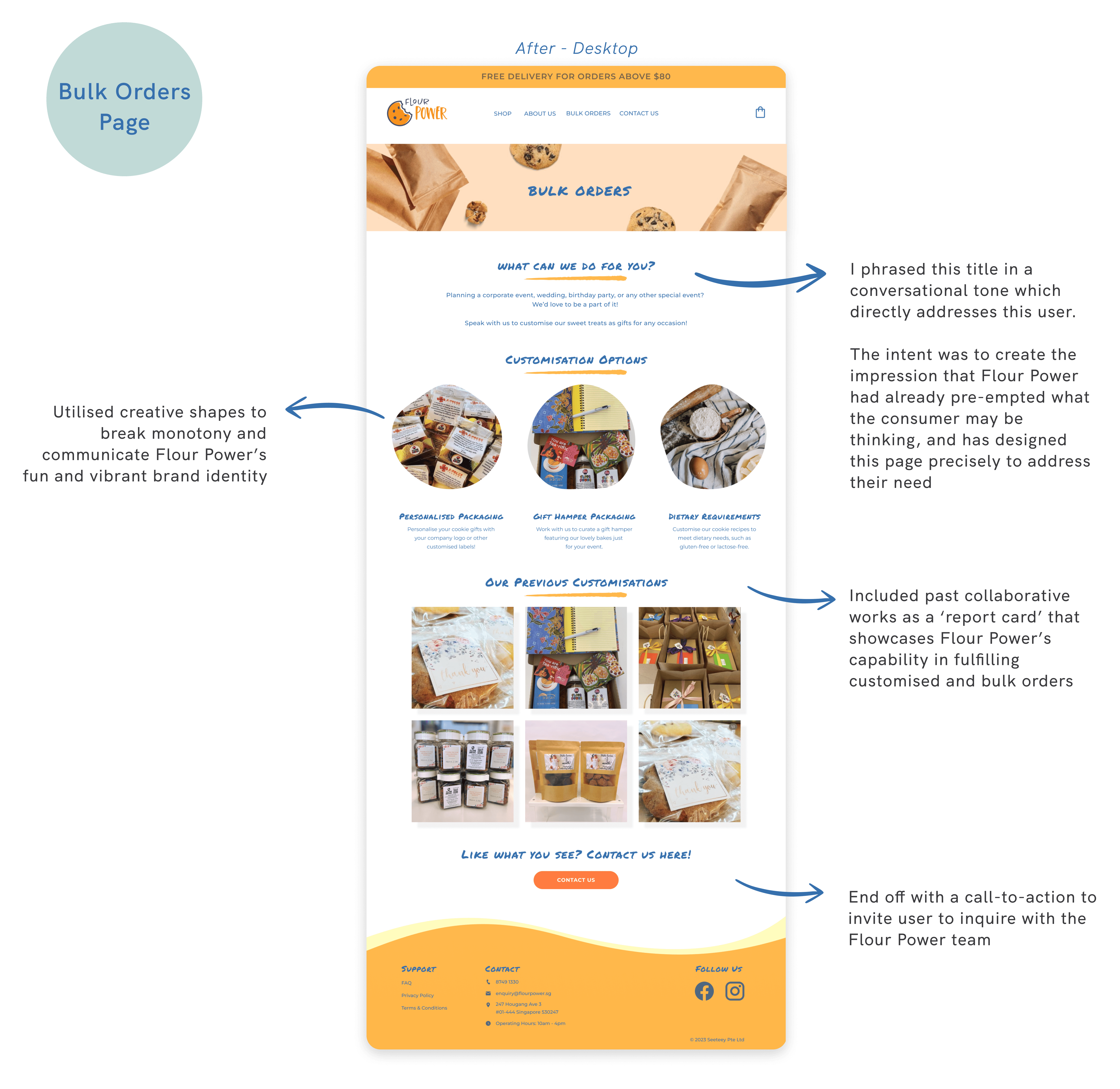
Bulk Orders

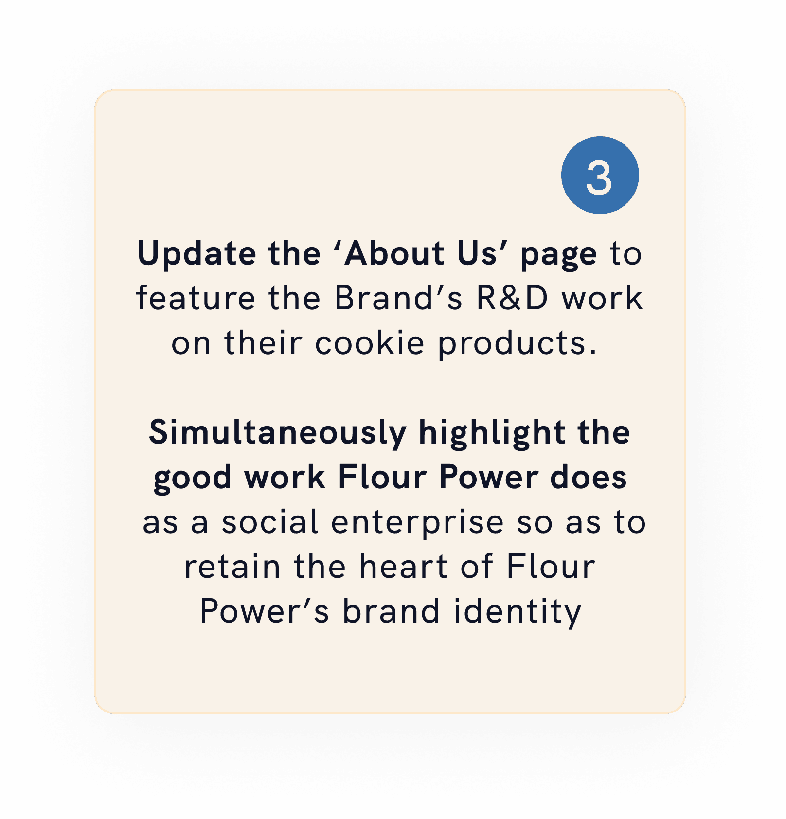
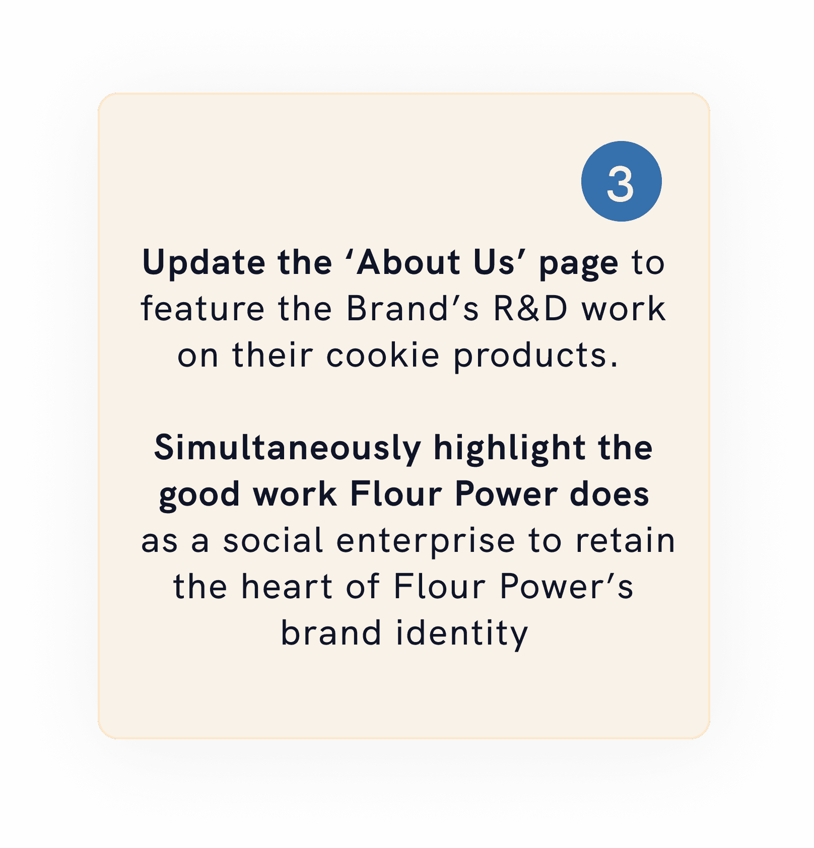
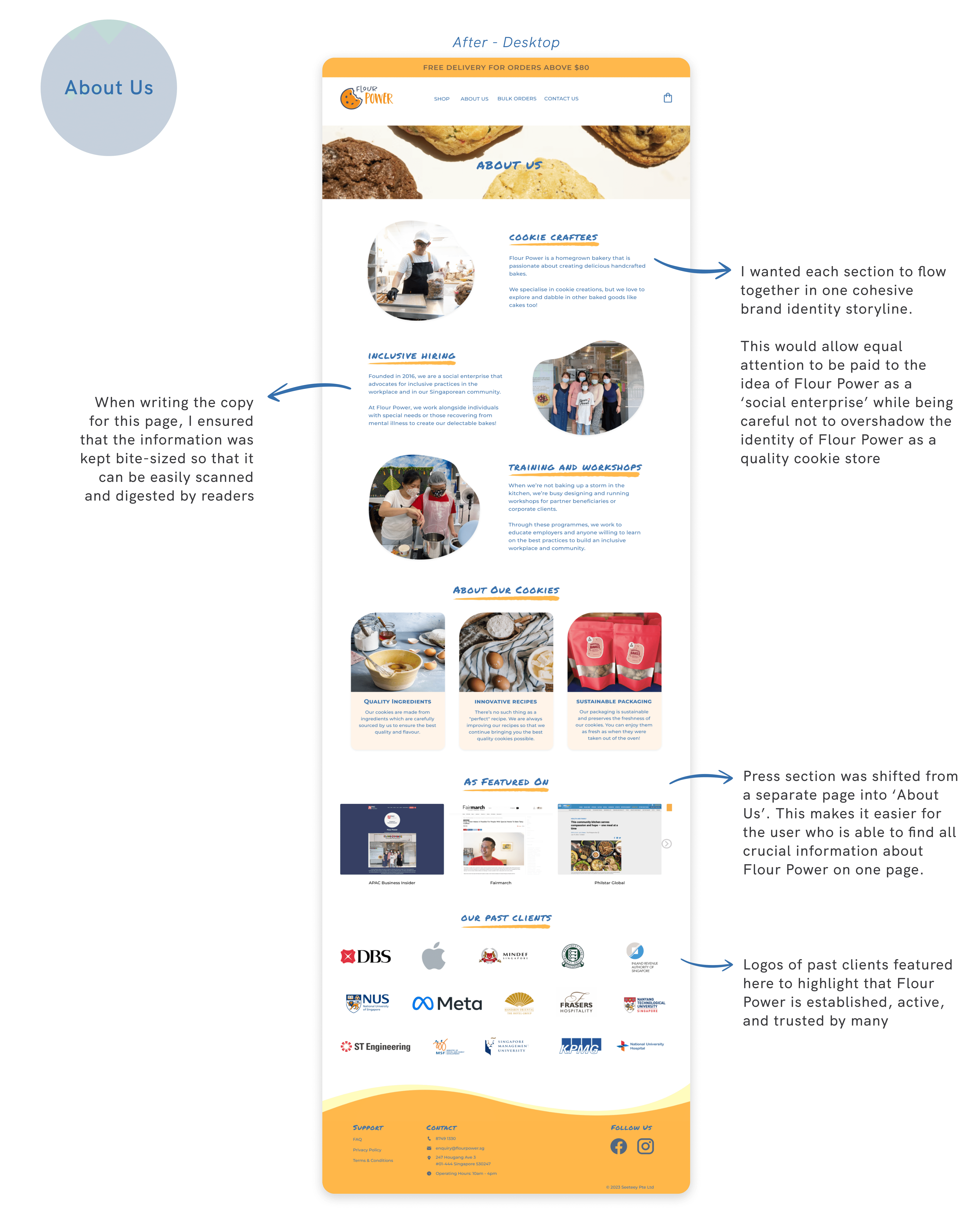
About Us

Retrospective

Retrospective

It doesn't pay to be perfect

It doesn't pay to be perfect

A key challenge my team faced was finding a visual design approach for the site that could balance the bold colours of orange, green, and blue of the Flour Power logo. In our quest for the 'perfect' design, we invested too much time at the start of the sprint, which caused us to rush to tie up loose ends at the end.


As project manager, it taught me the importance of time-boxing and prioritisation. There needed to be someone to focus on pushing us to the next step in order to keep pace with our timeline. This ended up being a key lesson that I then applied to my next team project: A Website Redesign for Ray of Hope, which you can view here! :)

Interested to know more?

Drop me a message via the channels below! I’d love to hear from you :)

Drop me a message via the channels below! I’d love to hear from you :)

Copyright

2023 by Qiao En. All Rights Reserved.