DURATION
3 week sprint, Feb 2023
TOOLKIT
Figma, Miro, Notion, Google Suite
TEAM
Project Manager
Built & maintained task dashboard, anchored team discussions, fronted client meetings & pitches on prioritization of features and deliverables
UX/UI Designer
User Research (Interviews, Contextual Inquiry, Competitive Analysis), User Journey Mapping, User Flows, Sketching, Wireframing, Prototyping, Usability Testing
The Problem
The Game Plan

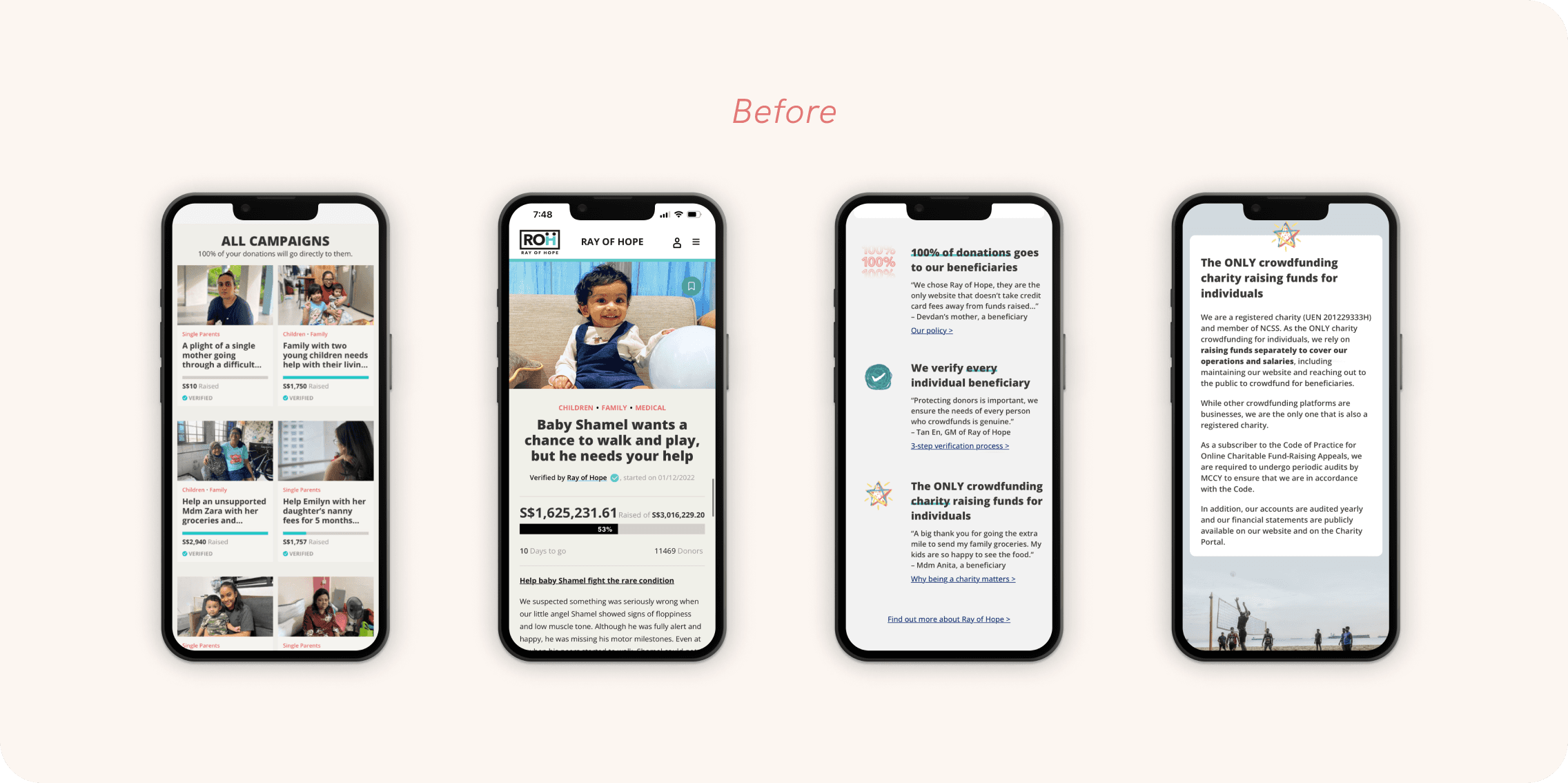
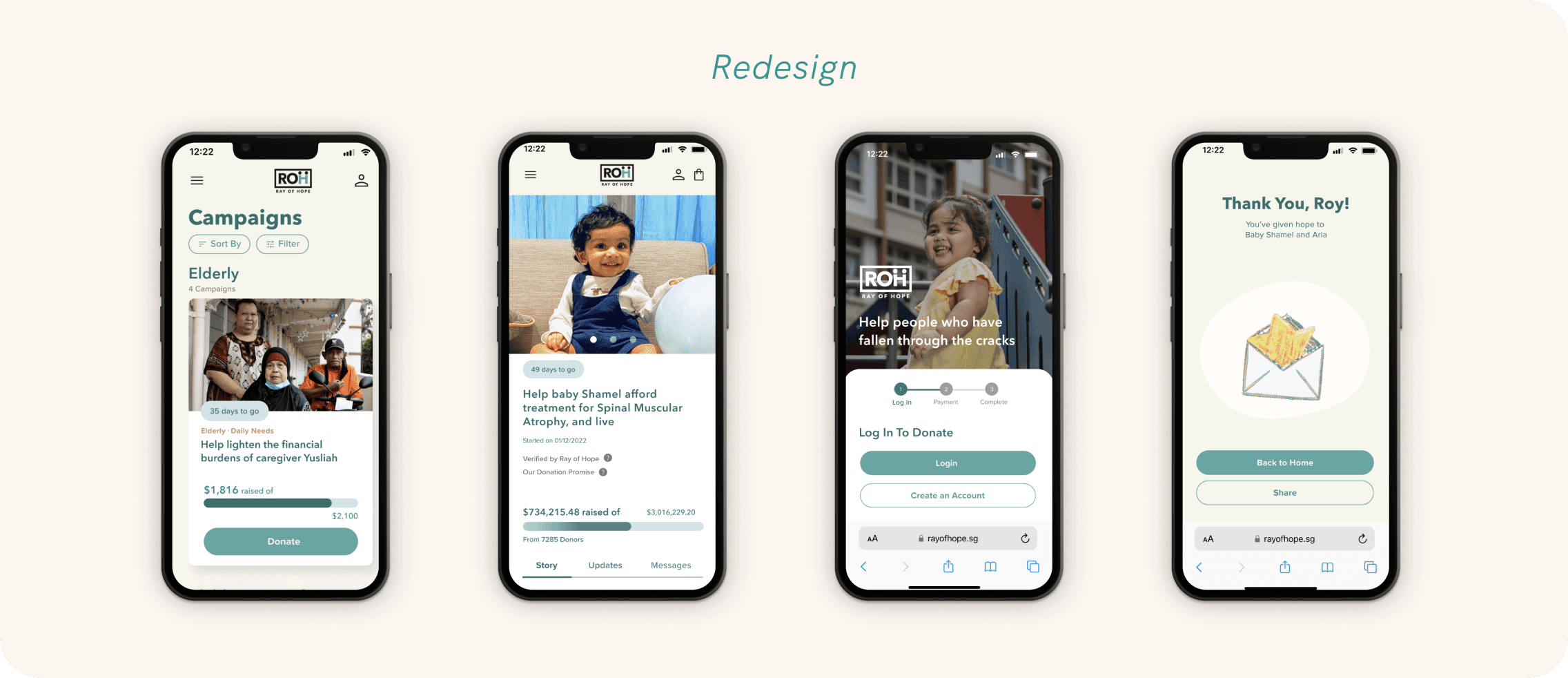
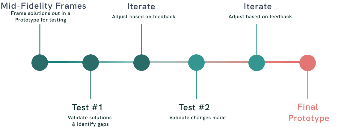
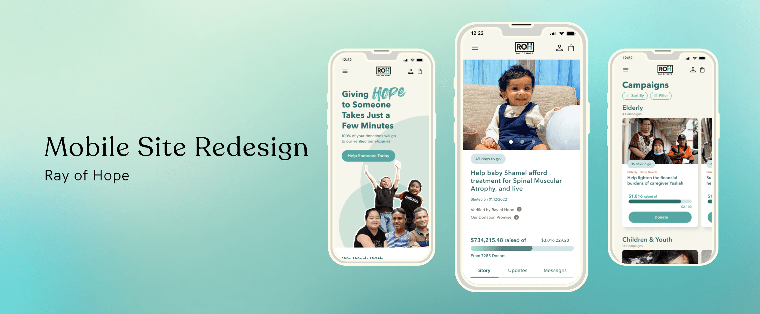
Conduct an entire site refresh to update the visual design and user interface to align with current digital design trends.

Inspiring visitor confidence forms the foundation of encouraging donor conversion and retention. This would be done by ensuring the website is modern and easy to use, which conveys the image of a professional and active organisation who is committed to the stewardship of their crowdfunding platform.

As 70% of Ray of Hope visitors are mobile-users, the team prioritised designing for mobile interfaces first during this sprint.
Measuring Outcomes


Qualitative Insights
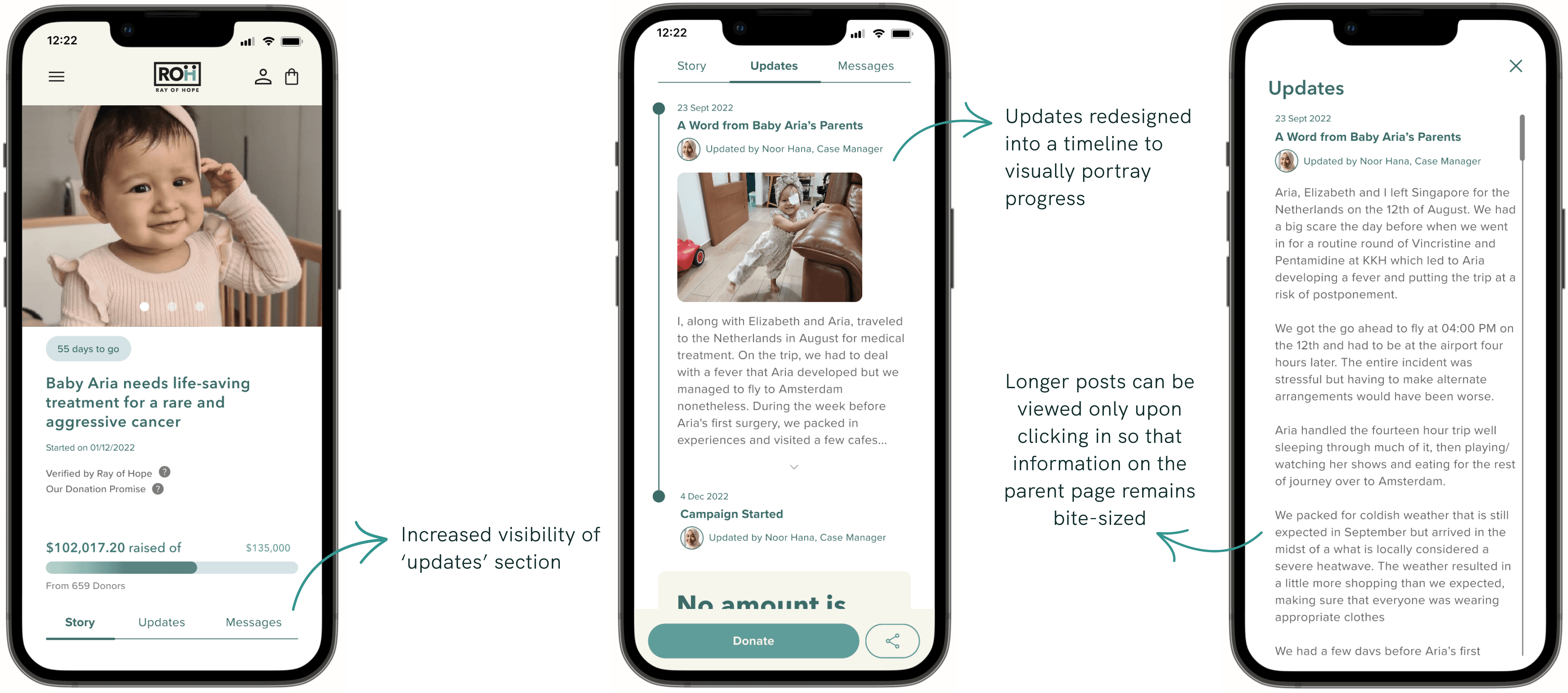
During usability tests, users shared that the redesign felt trustworthy, warm, mature and professional.
The insights gathered provided an additional layer of assurance that the redesign was effective in achieving the goals we had outlined for this sprint.
Our research strategy to uncover the root causes of the site's challenges was two-fold: we would speak to users while also conducting market analysis to piece together a more comprehensive picture.

13 user interviews were conducted to gain qualitative insights on donor goals, motivations, and frustrations


Insights from contextual inquiries highlighted user pain points on the current site, especially for 4 key pages: Home, About Us, Overall Campaigns and Individual Campaign pages.
Given that these pages had the highest donor touch points, prioritising them in the redesign would yield a higher impact on the overall donor experience.
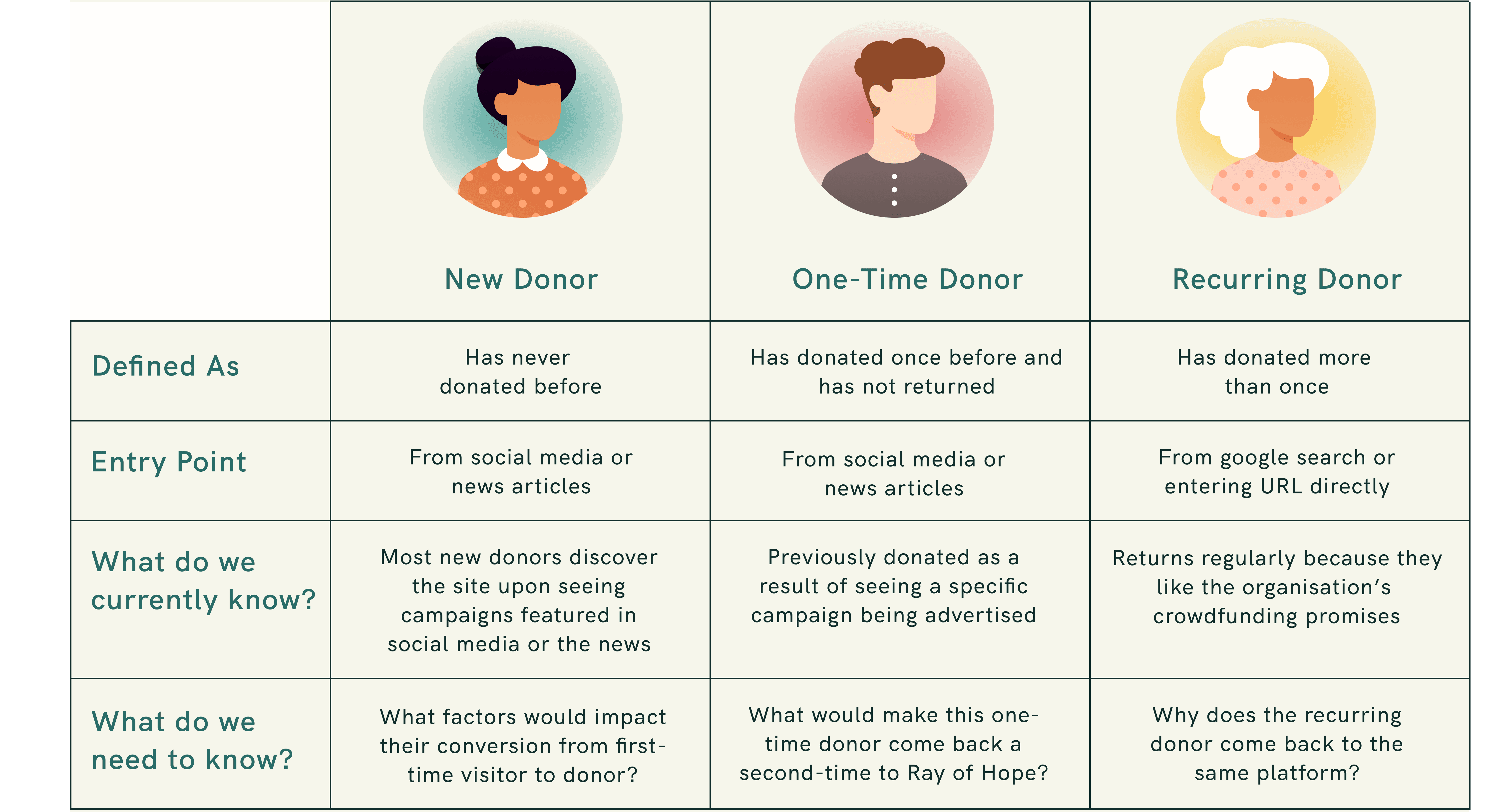
Defining core user needs


Brainstorming!
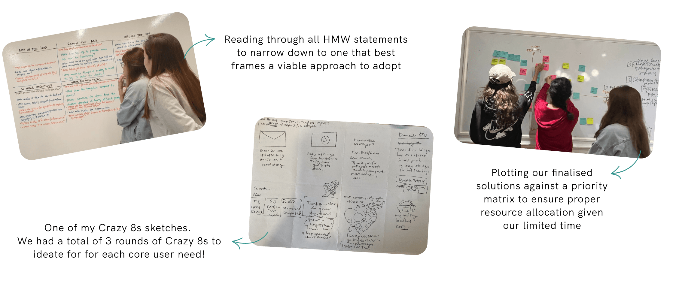
As project manager, I felt it was important for the team to meet in-person so we could whiteboard and sketch out our ideas. Having an open space for organic discussion helped us to let our imagination run wild and get our creative juices flowing.
In a one-day design studio, I led the team through How Might We brainstorming, Crazy 8s Sketching, and a prioritisation exercise of our final solutions.
For each exercise, the approach adopted was to ideate without boundaries before bringing the team together and leading a discussion to synthesise our ideas into viable and actionable solutions.
Design & test
Key solutions to address the 3 core user needs

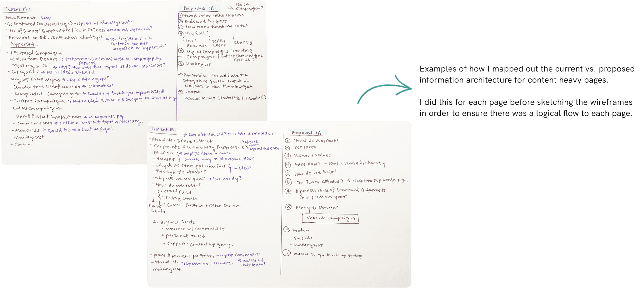
Clear information architecture for content-heavy pages
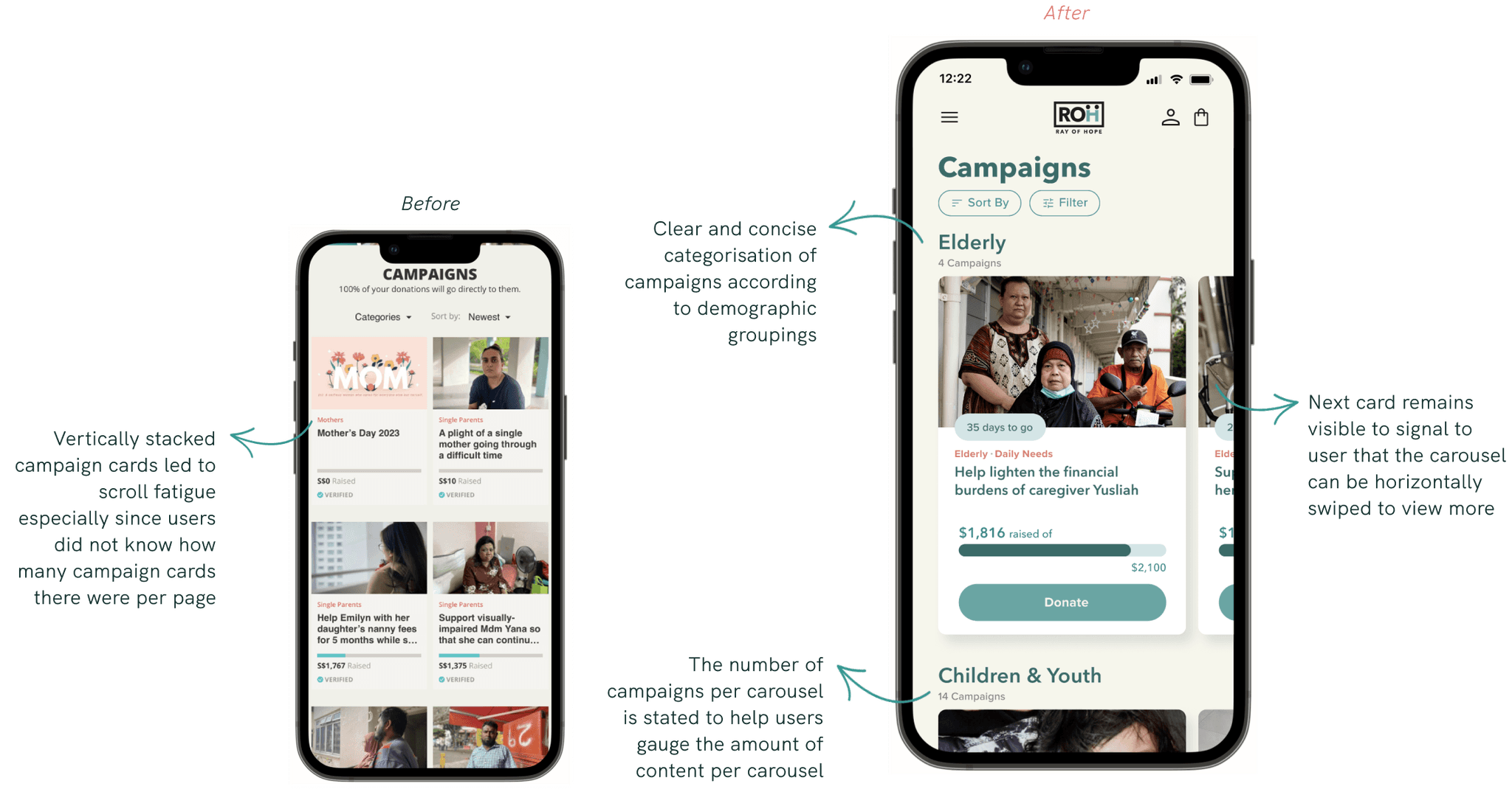
Simplified campaign categories
Utilising a ‘carousel’ navigation to reduce browsing fatigue

Highlight progress of campaigns
Opt-in mailing list for updates on the beneficiary's welfare
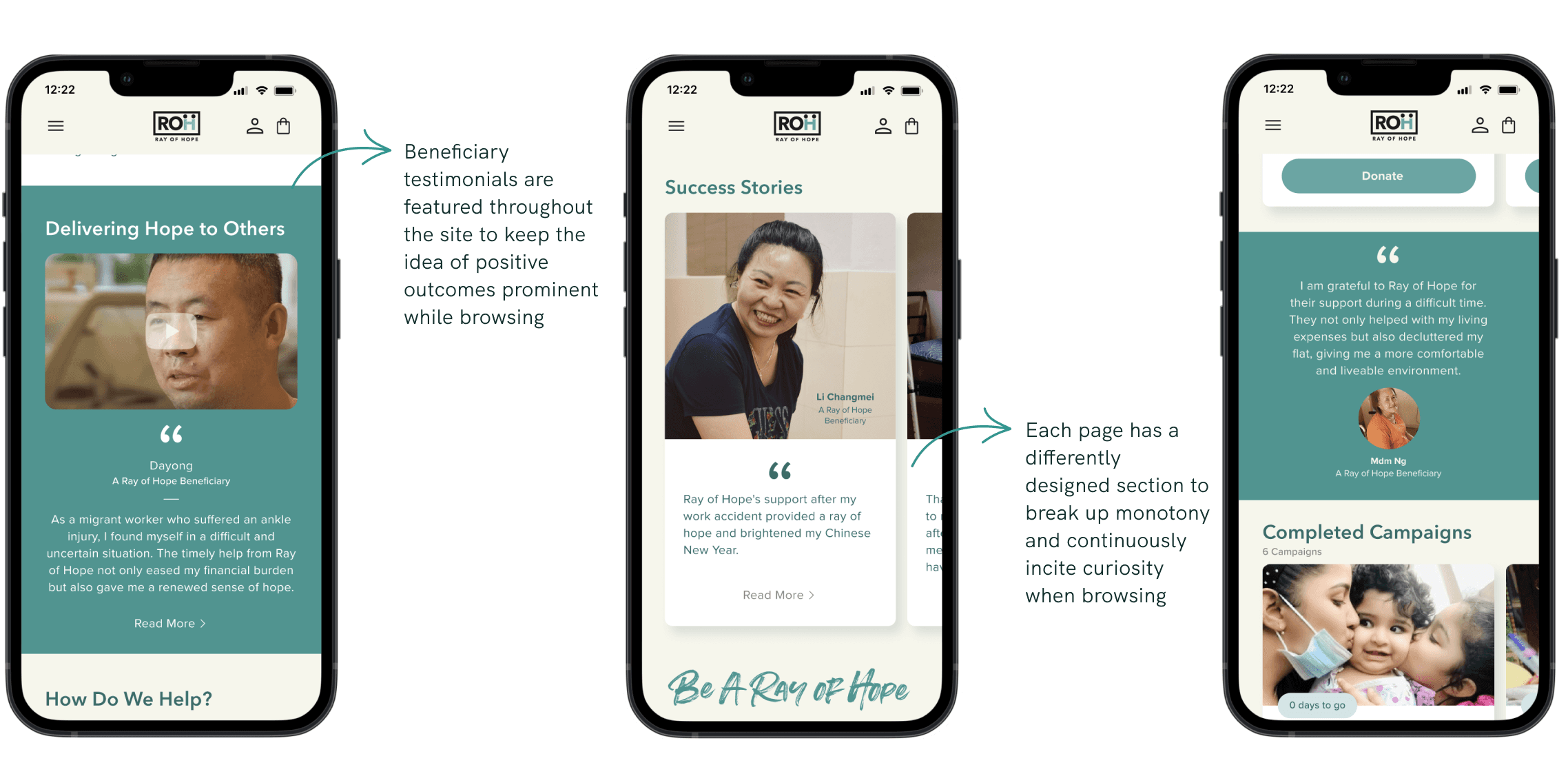
Showcase beneficiary testimonials

Showcase team and board members
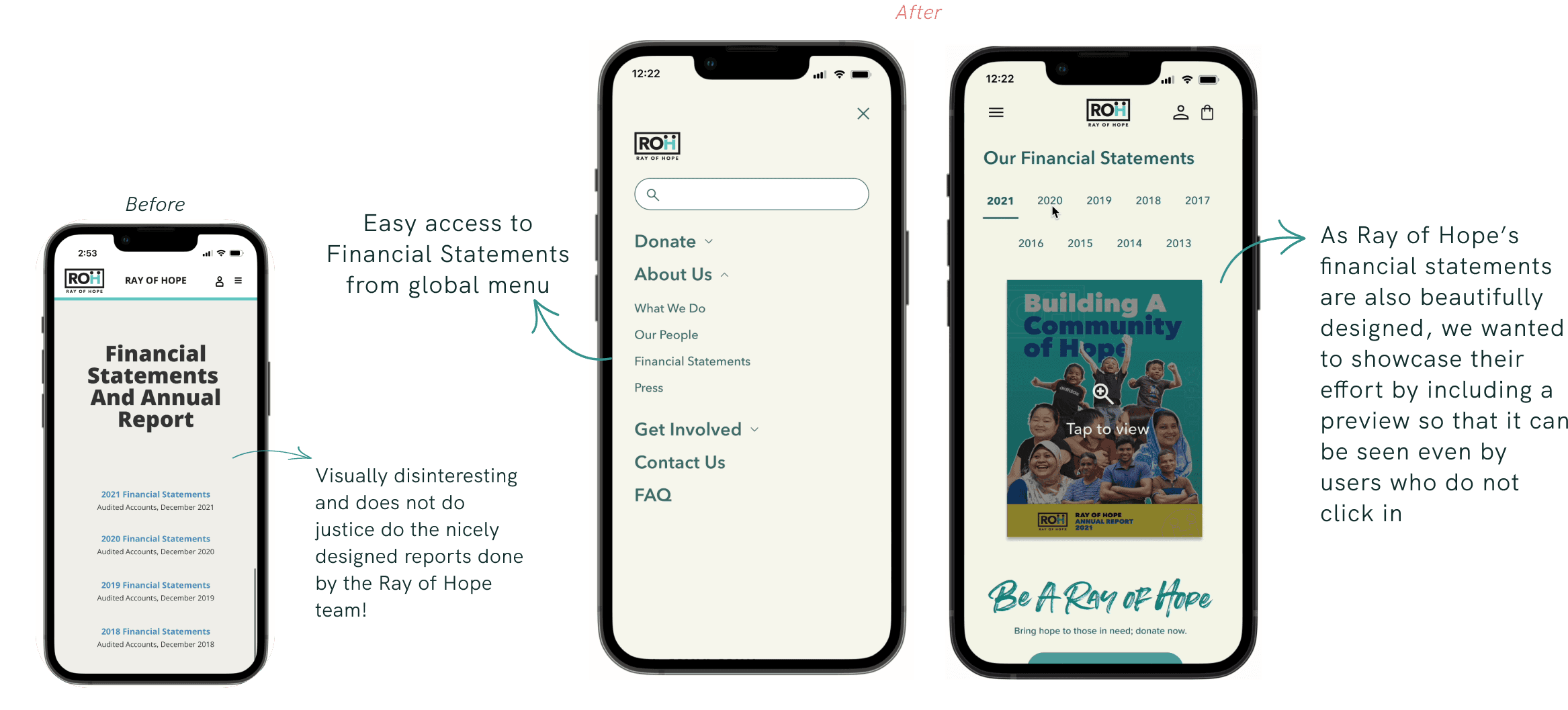
Spotlight financial statements
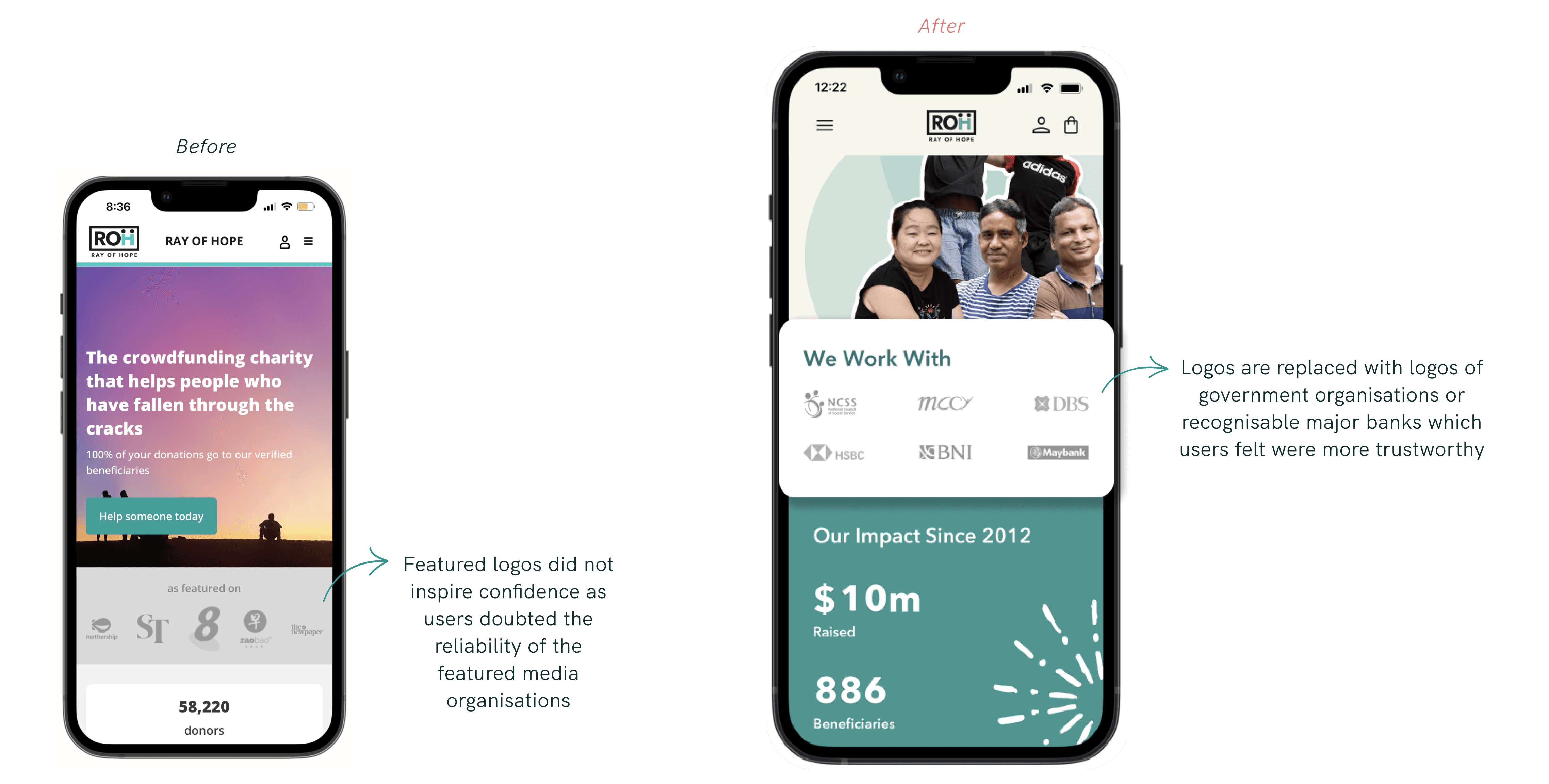
Partnerships with government agencies
Feature - 1/3
To build trust with donors, it was essential to showcase information about Ray of Hope's charity work and crowdfunding model on the site. However, we needed to strategise the immense amount of content on each page so that it was easy to digest.
Feature - 2/3
Feature - 3/3
Users felt flooded by long columns of campaign cards when browsing. We streamlined this by grouping campaign cards into carousels according to the campaign categories.
This reduced feelings of overwhelm when browsing as it created breakpoints in an otherwise endless stream of campaign cards.
Feature - 1/3
Feature - 2/3
Feature - 3/3
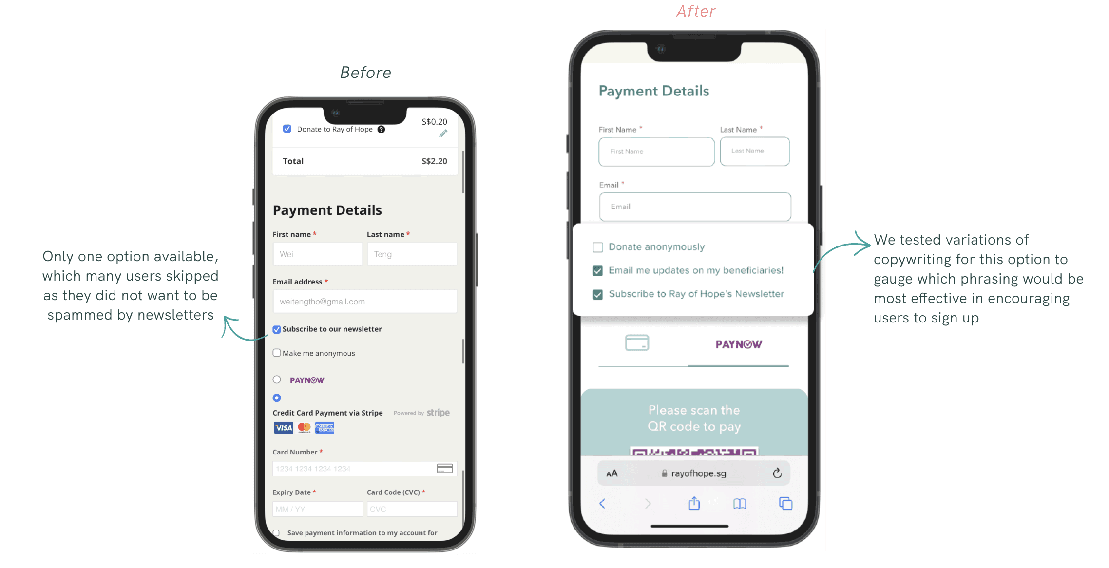
From our research, we knew that users did not find mailing lists appealing as they often equate it with spam. However, we discovered that users are open to subscribing to an e-mailer specifically for updates on their beneficiary’s progress.
As such, we created an opt-in option at checkout to subscribe to the targeted e-mailer. This would also help Ray of Hope to establish communication channels with a wider pool of donors.
Feature - 1/3
Users wanted to see the faces behind Ray of Hope as it demonstrated a commitment to transparency. However, they had difficulty finding this page as it was hidden in the footer on the original site.
We shifted this information into “About Us” to increase its accessibility as it was the page most users would navigate to when trying to learn more about Ray of Hope.
Feature - 2/3
Feature - 3/3
An interesting research insight was the general lack of regard users had towards the current ‘As Featured On’ section. Users felt the news media icons shown were not assuring, as news articles may be doctored or lack fact-checking.
We decided to change this section from “As Featured On” to “We Work With”, which allowed us to feature logos of Ray of Hope partners who are government-affiliated or corporate banks. which could inspire more confidence in users.
Interested to know more?
Copyright
2023 by Qiao En. All Rights Reserved.

